Brio Engineering – Logo & Graphics
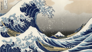
Brio Engineering focuses on sustainable solutions to problems, particularly with harnessing the power of natural energy. The Great Wave off Kanagawa (The Great Wave) by Katsushika Hokusai became the inspiration for the logo.
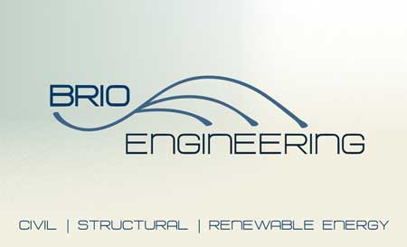
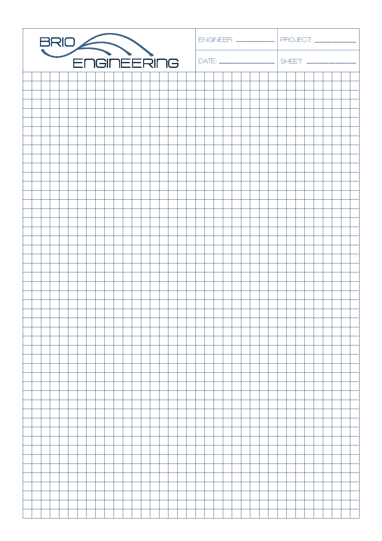
The square stylised characteristics of Hurtmold Font denote modernism, structure and strength, while the colour palette has been influenced by the Japanese painting The Great Wave. Below is the engineering work pad design.
| CLIENT | BRIO ENGINEERING |
| BRIEF | A Logo, and graphic design using ‘The Great Wave’ as inspiration. BRIO engineering focuses on sustainable engergy solutions. The great wave being a symbol of ongoing engery and forward motion. |
| RESPONSE | Simple lines to denote a wave in forward motion. Modern/ clean / square font to denote the future and mathematical elements of engineering design. |
| DESIGNER | Paula Jayne |
