Montville Artisan Village – Branding & Graphics
Montville Chamber of Commerce contracted Seedhead to research and develop positioning and a logo for their town. In its heyday during the 70s Montville was a hub for artists. Today, Montville is renowned for its artists, art galleries, weddings, and romantic weekend escapes. The logo has been developed using a monogram as the basis of the design. Artists have used monograms for centuries to mark their work. Often monograms are used for upmarket historic events such as weddings. This monogram joins with a heart in its centre, denoting love, and integrity.

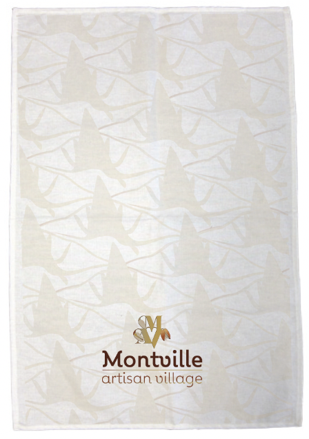
Paula designed a pattern is based on the bunya nut pod. The Bunya tree and its nuts are historically important to the town. Indigenous people gathered on the Blackall Range to feast on the bunya nuts. Weddings and ceremonies took place between clans. Therefore the bunya tree and its nuts denote ceremony, history and place. This pattern can be used on merchandise in combination with the logo
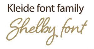
Kleide (font) is formal to match the brief of ‘elegant’ and ‘upmarket’ but not stuffy or old-fashioned. There are sufficient numbers of font weights to add versatility to any design used under the Montville branding. Shelby is also used sparingly as a handwritten font denoting handmade and is used to highlight quotations and important points.
CLIENT |
MONTVILLE ARTISAN VILLIAGE |
SCOPE |
Design a logo to attract tourists visitors and the right retailers to Montville Elements of Logo include: Art Element / Heritage Feel (But Upmarket) / Natural Beauty Element / Romance Element The Artisan Village logo aims to refocus Montville as a creative place, where visitors can find artisan products be it jewellery, photography, gourmet food, pottery, furniture or a painting. The design supports a marketing strategy to reinvigorate and position Montville as the place for an authentic artisan experience. |
RATIONALE |
The survival of Montville as a place to live & visit rests on people’s perception of Montville. A logo that represents the unique elements of Montville town ensures that the town moves toward strengthening these unique elements. A Montville ‘identity’ gives a visual and emotive framework for businesses to move forward in the right direction. An official Montville logo discourages piecemeal mock-ups generic tourism catch cries that places Montville as ‘one of many’ as opposed to placing Montville as a unique individual town. |
DESIGNER |
Paula Jayne |
CREDITS |
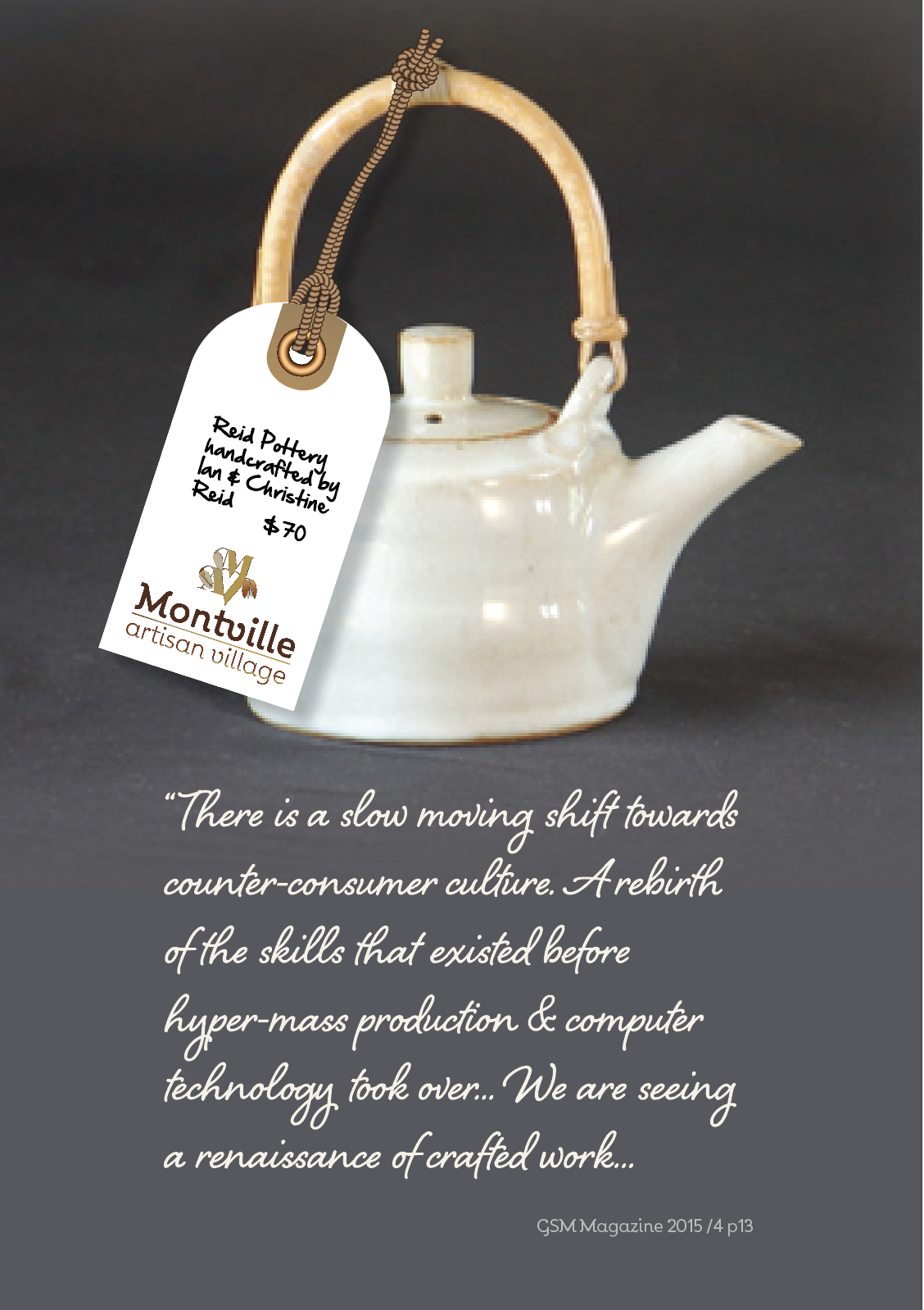
Pottery by Reid Pottery |
